

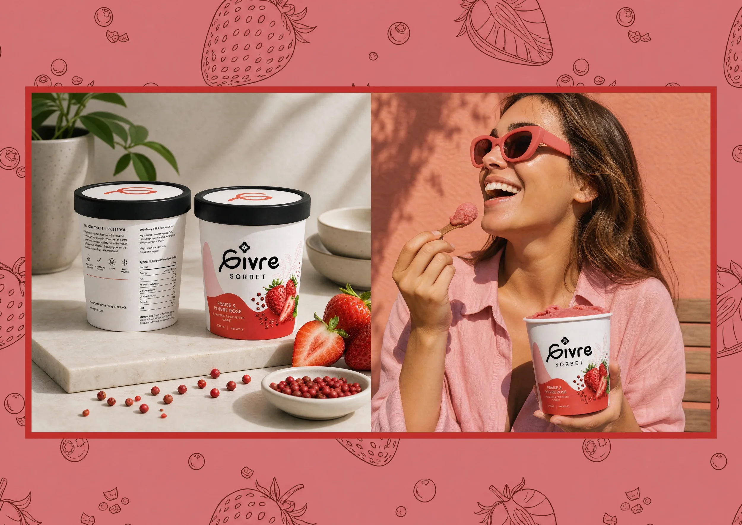
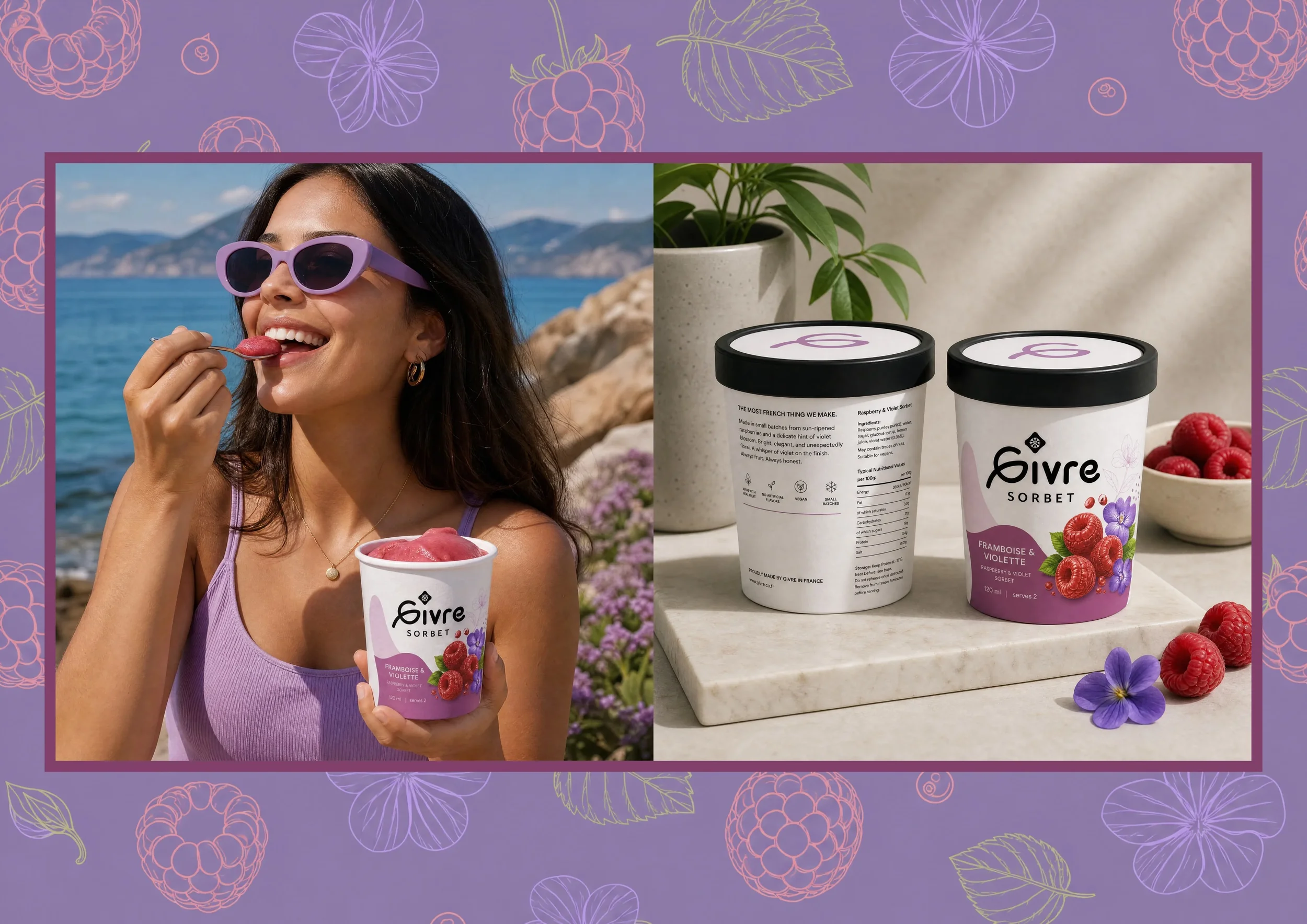
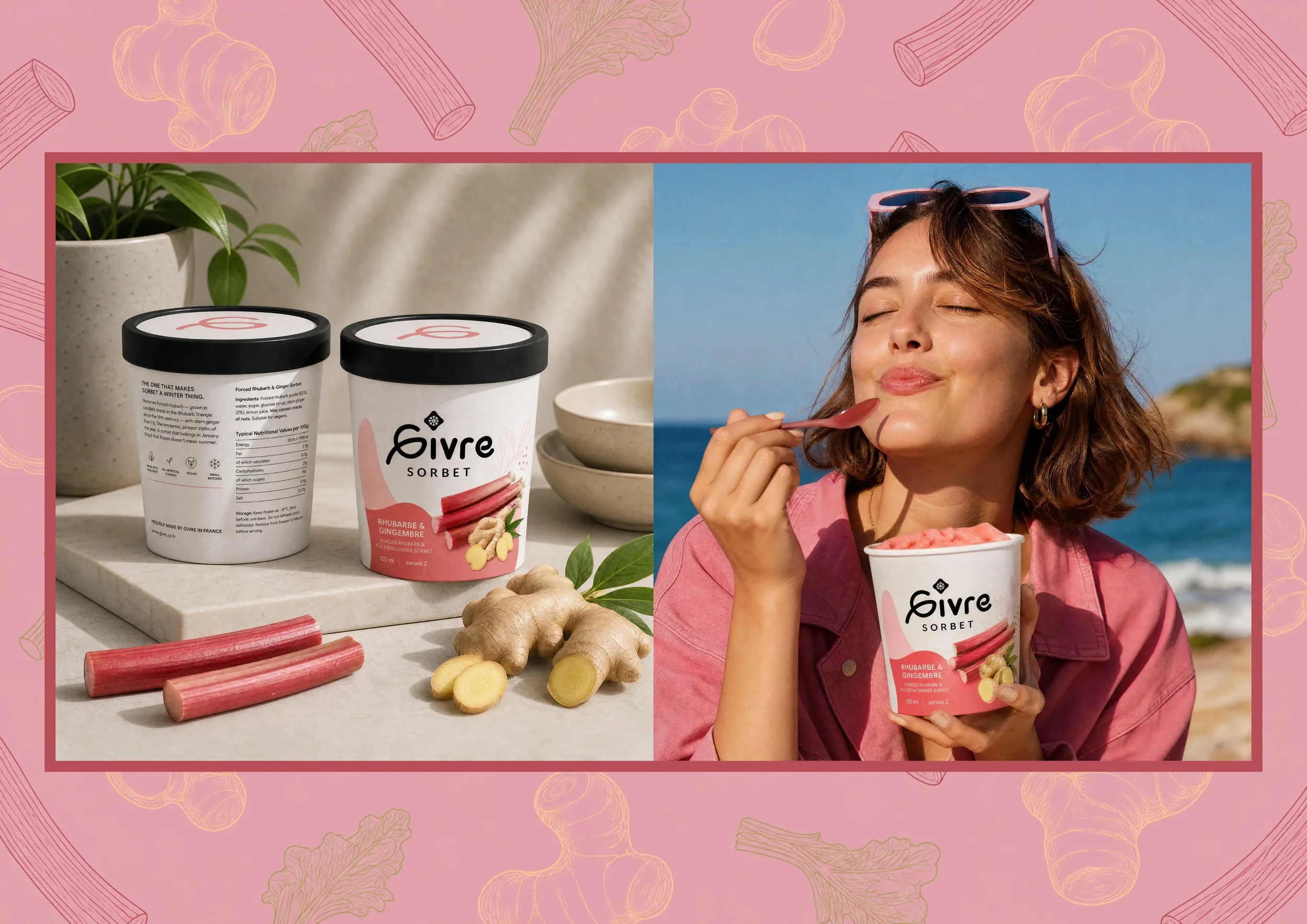
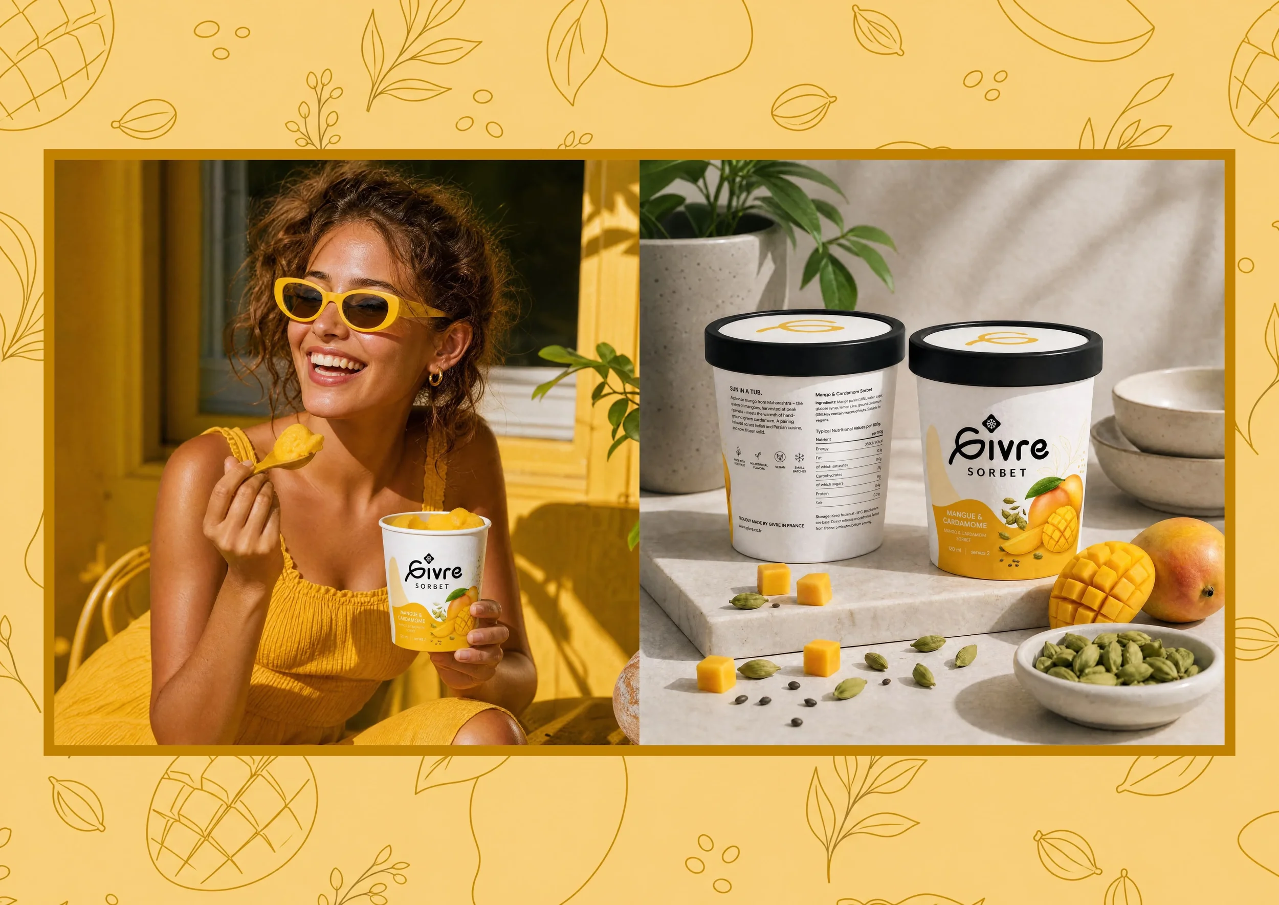
Givré Sorbet .
Logo and PackagingA premium artisan sorbet brand targeting consumers who treat food as an aesthetic experience, not just a meal. The client had a name - Givré, French for frost - and a conviction that the premium frozen dessert market was playing it far too safe. Clinical white packaging on one end, rustic farmers market on the other. Neither felt right for a product built on French artisanship and unexpected flavour combinations.
The scope was total. Name rationale, logo, icon, colour system, typography, multi-SKU packaging across six flavours, and full brand guidelines. Nothing left undecided.
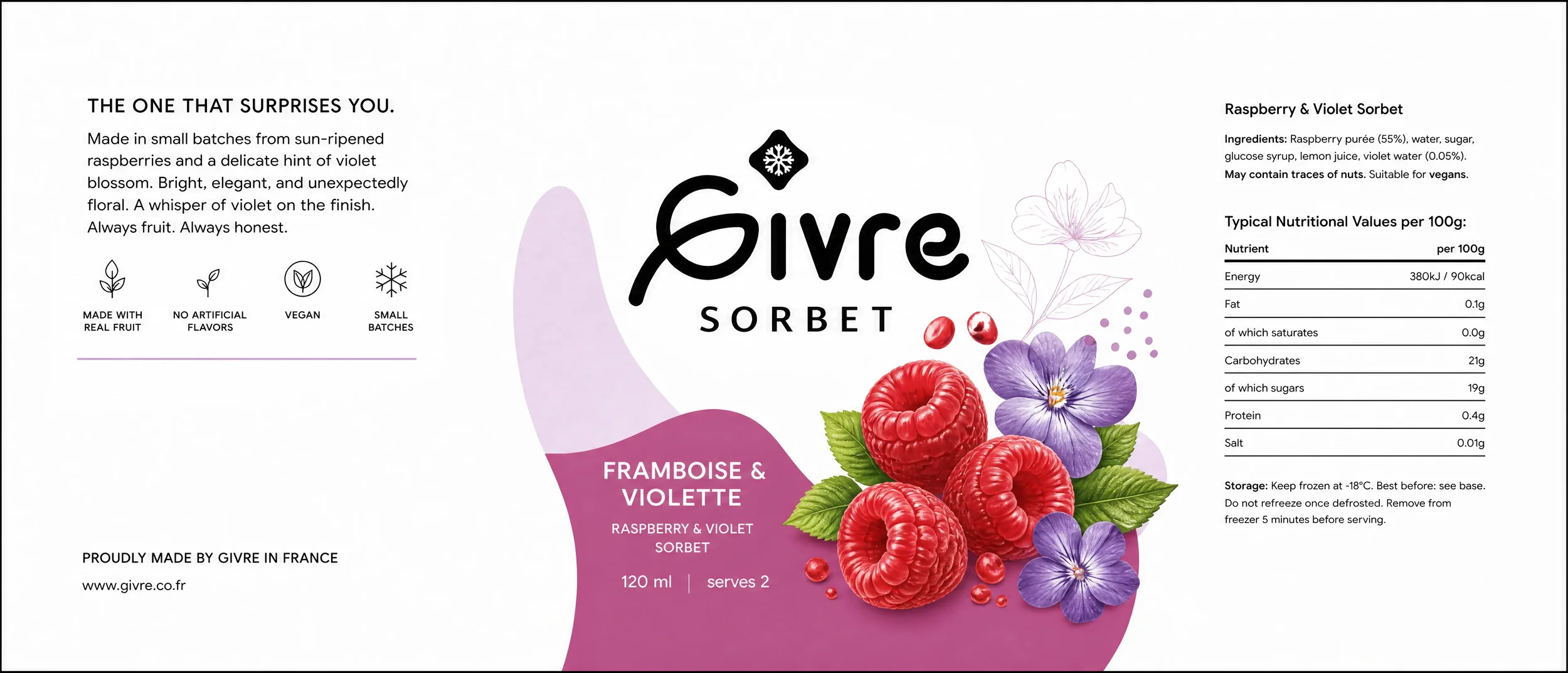
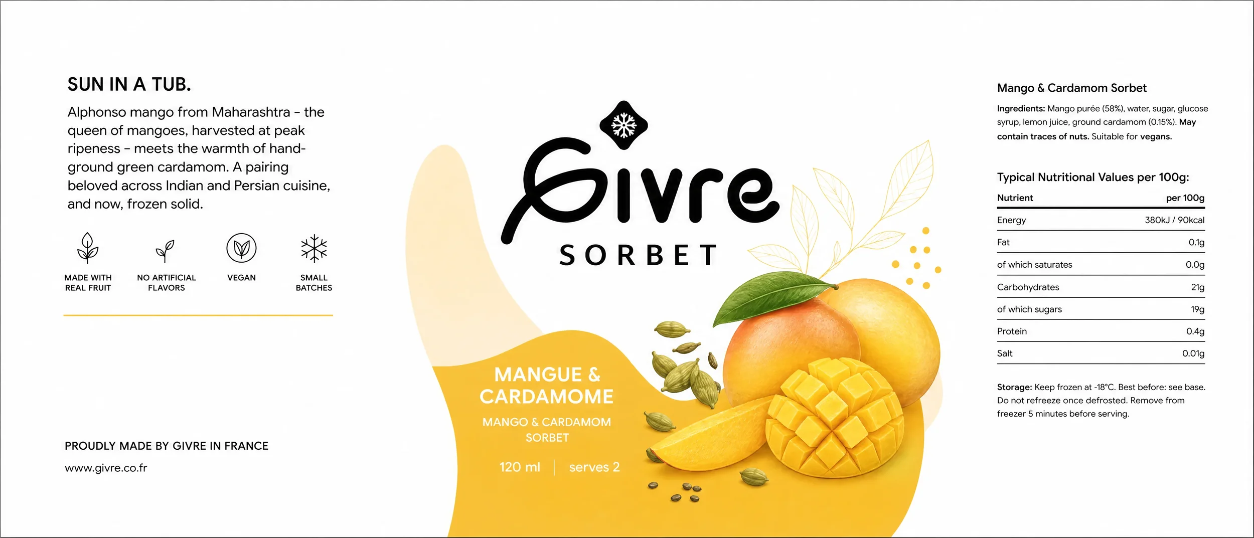
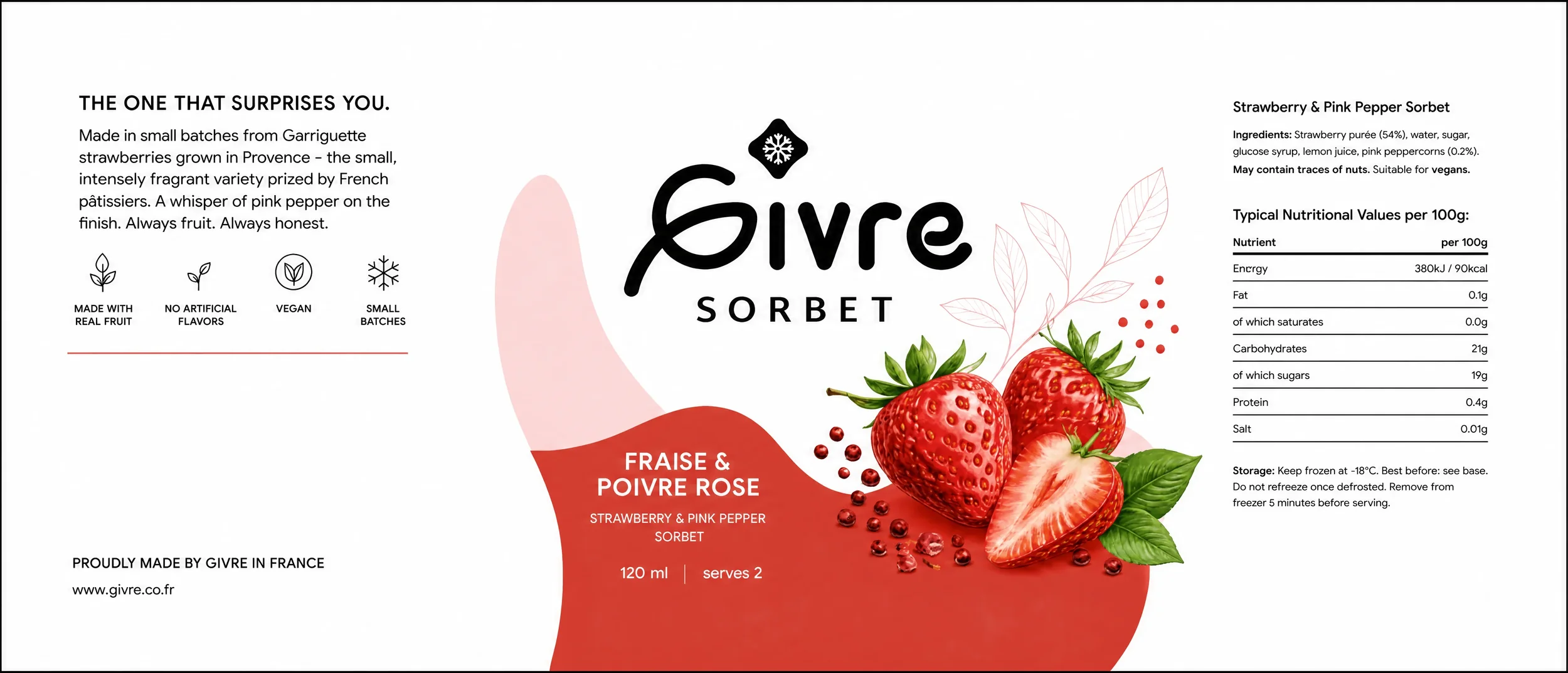
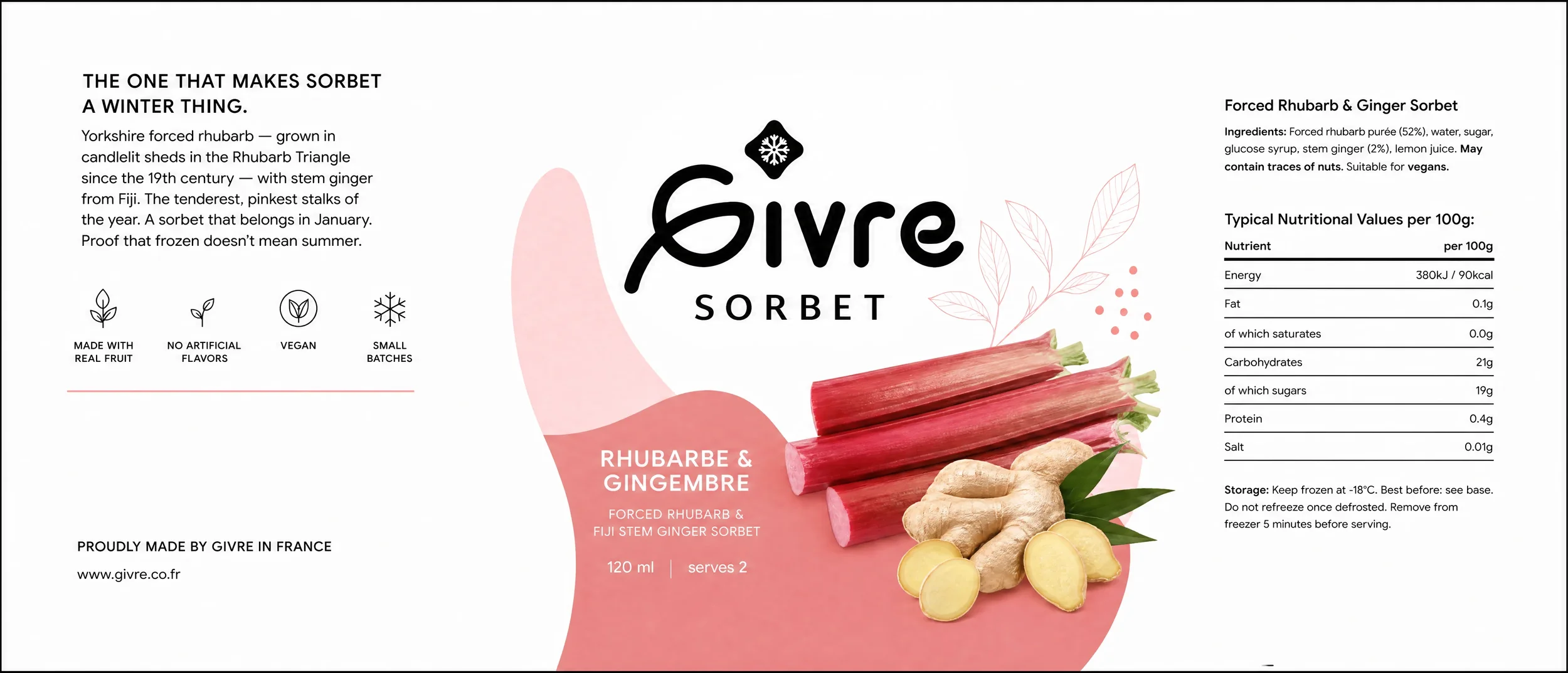
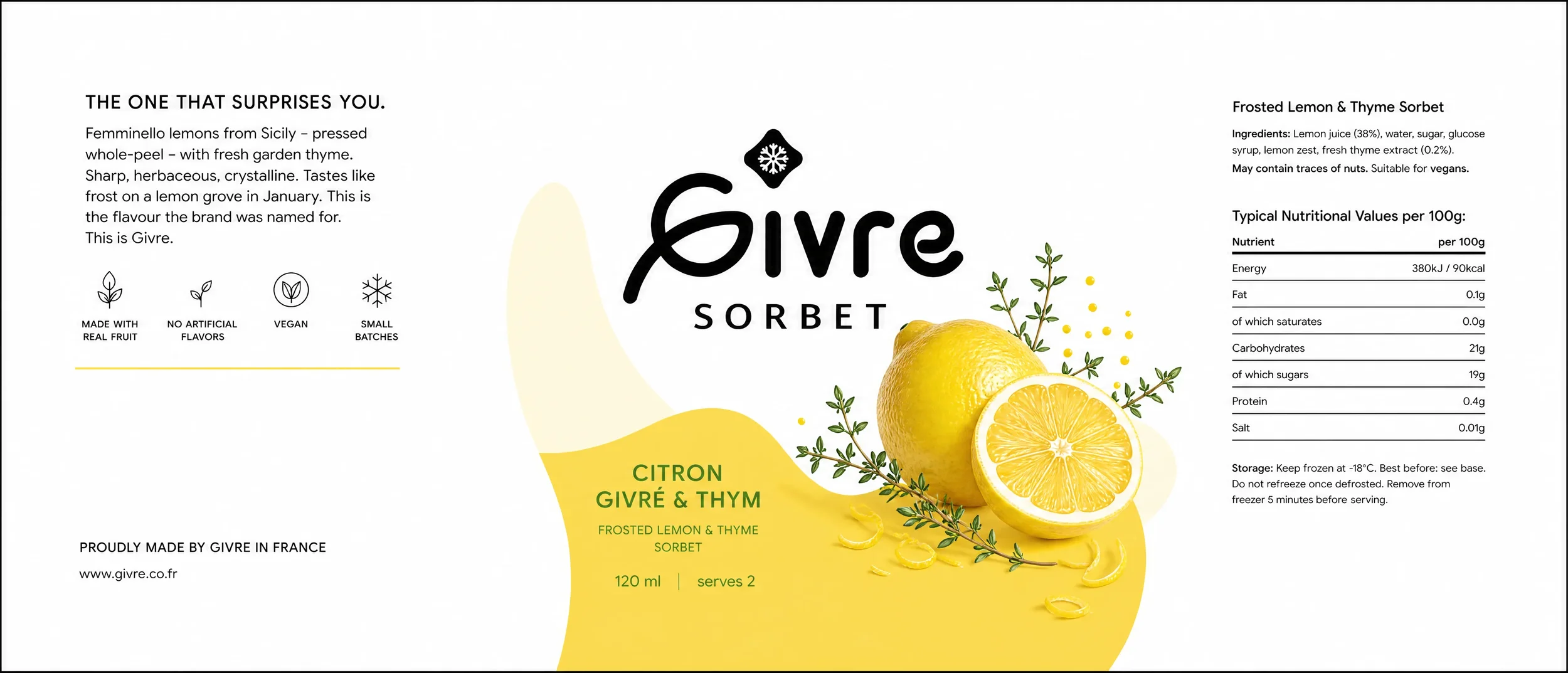
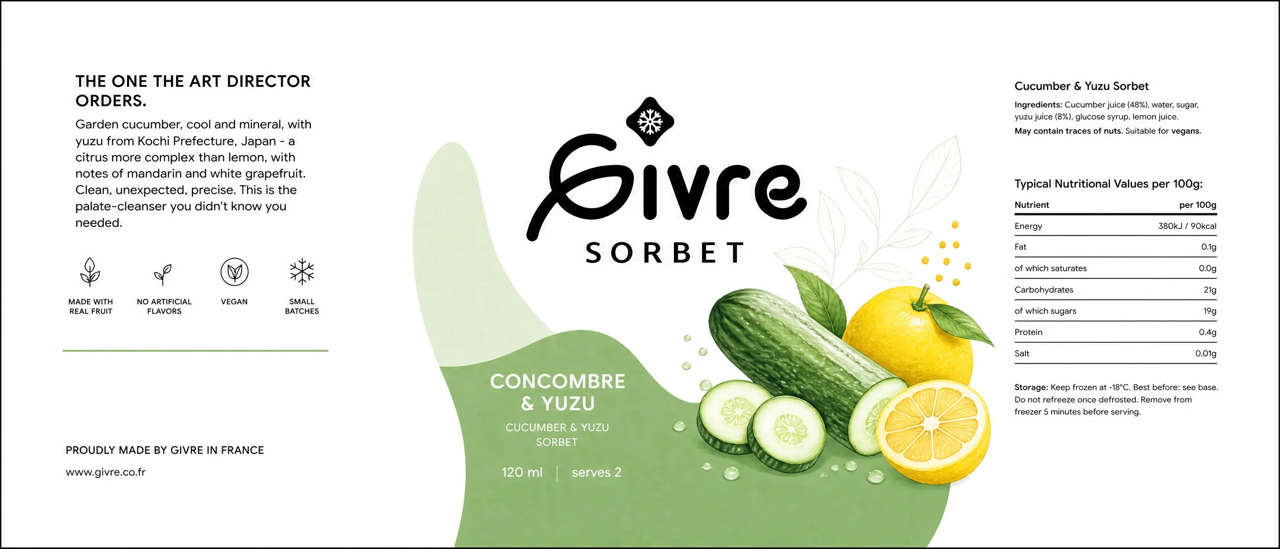
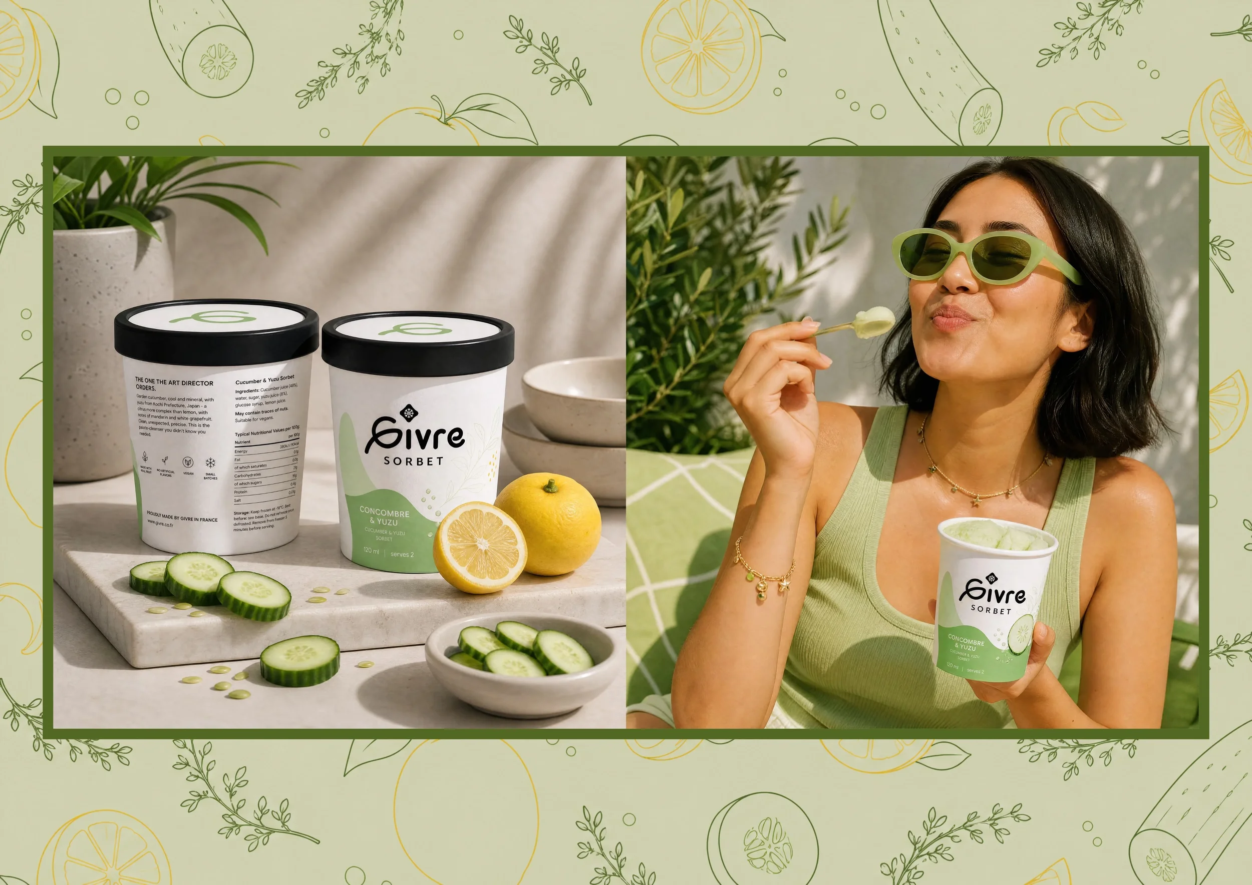
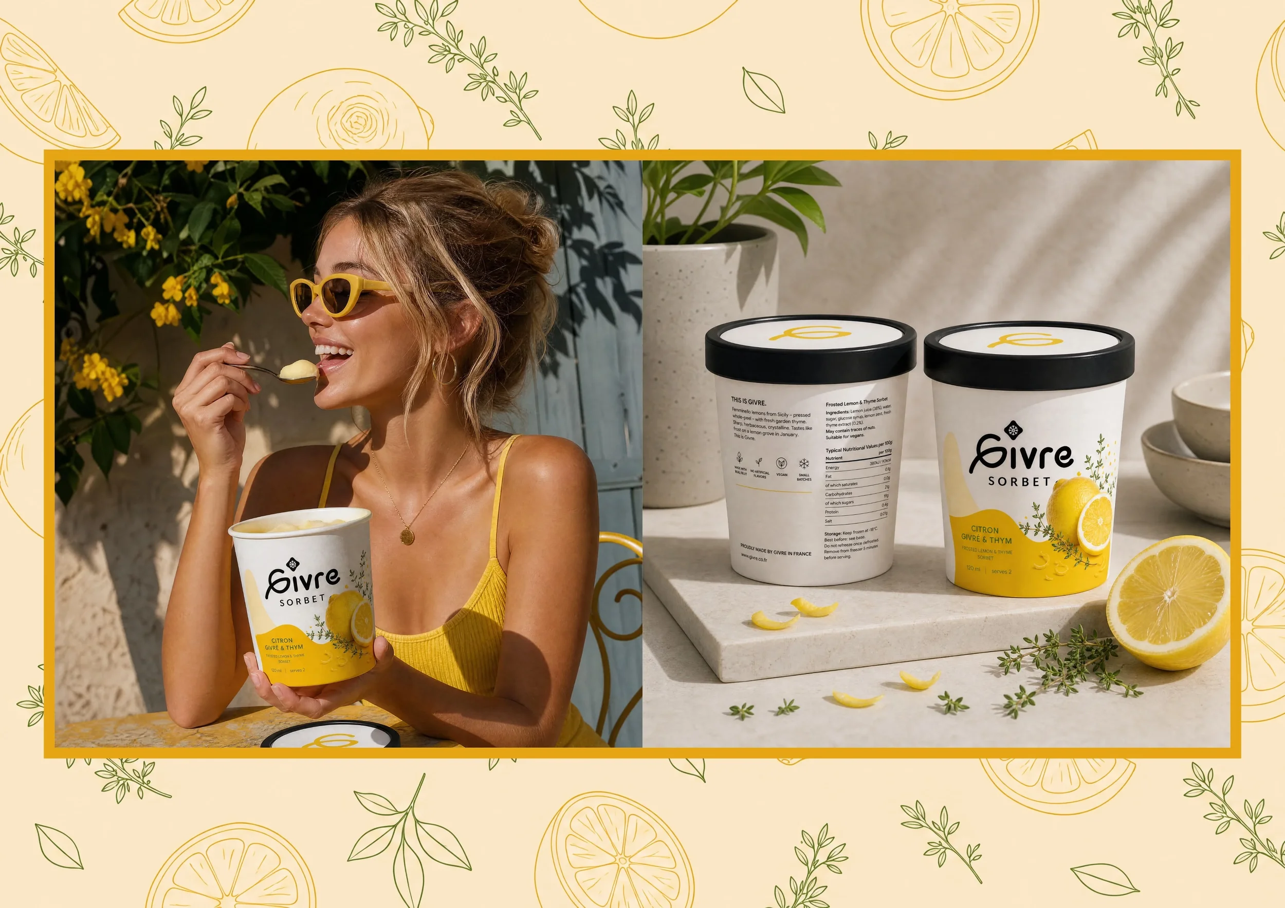
Givré had to feel elegant and joyful at the same time. Two qualities no competitor in the category owned simultaneously. The wordmark is handcrafted script - personal, warm, and distinctive enough to read as a signature on a tub held at arm's length in a freezer aisle. Paired with a geometric frost crystal icon, it holds the meaning of the name visually without spelling it out.
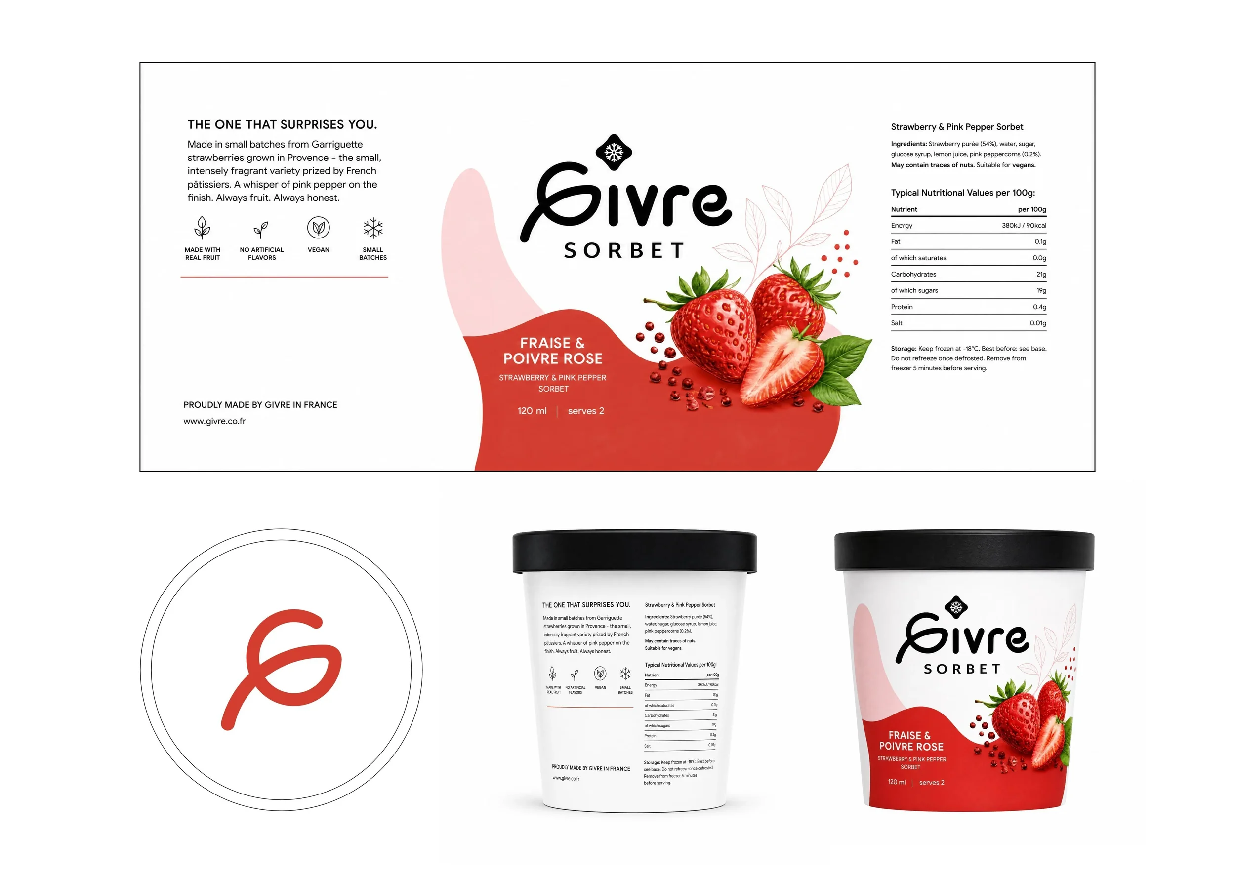
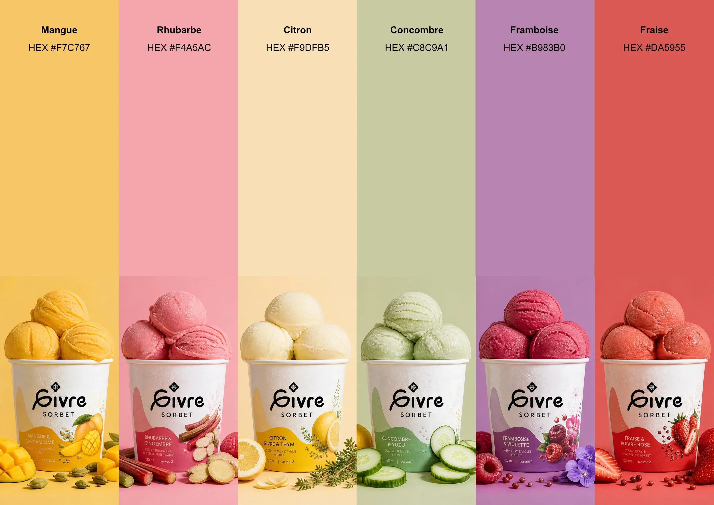
Six flavours, six colours. Lemon, mango, raspberry, passion fruit, blood orange, blackcurrant - each one given a considered colour, a Pantone reference, and a packaging treatment that felt part of the same world. The tub design carries the wordmark, the crystal, and the flavour colour in a hierarchy that works at every size - from shelf to spoon to social media.
Curious to see more of what I do? Explore more of my projects.
Contact .
Let’s Connect .
Got a project in mind? Whether you're starting from scratch or ready to take your brand to the next level - I'd love to hear from you.