
Safiul Basher .
Brand IdentityAfter eight years building brands for clients across fashion, food, and professional services, one project remained incomplete - my own. The temptation with a personal brand is to make it clever, to make it trend, to make it everything at once.
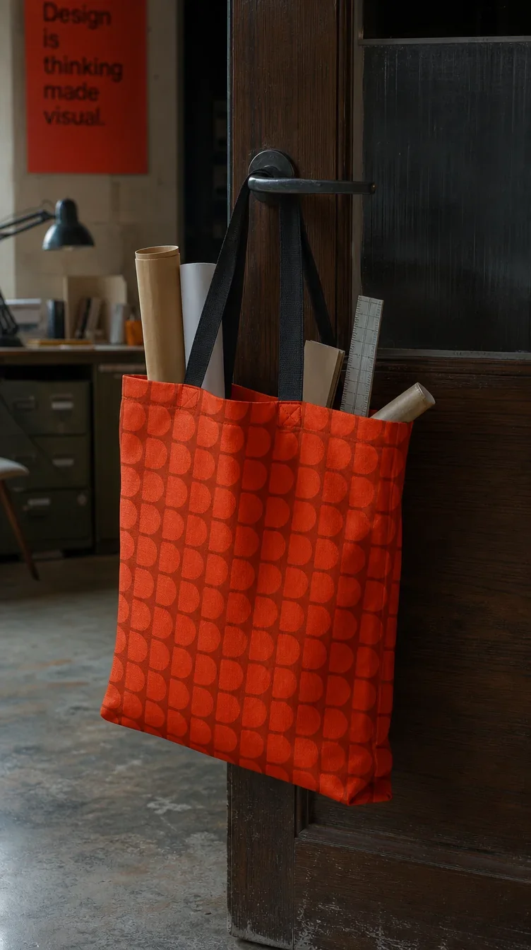
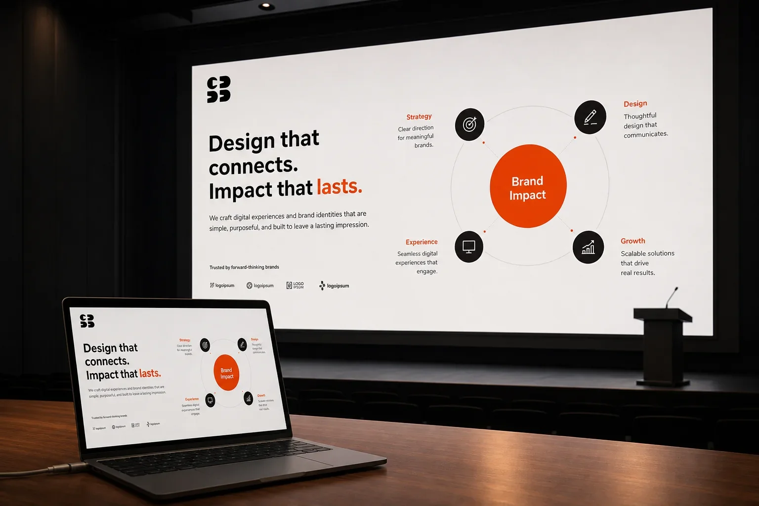
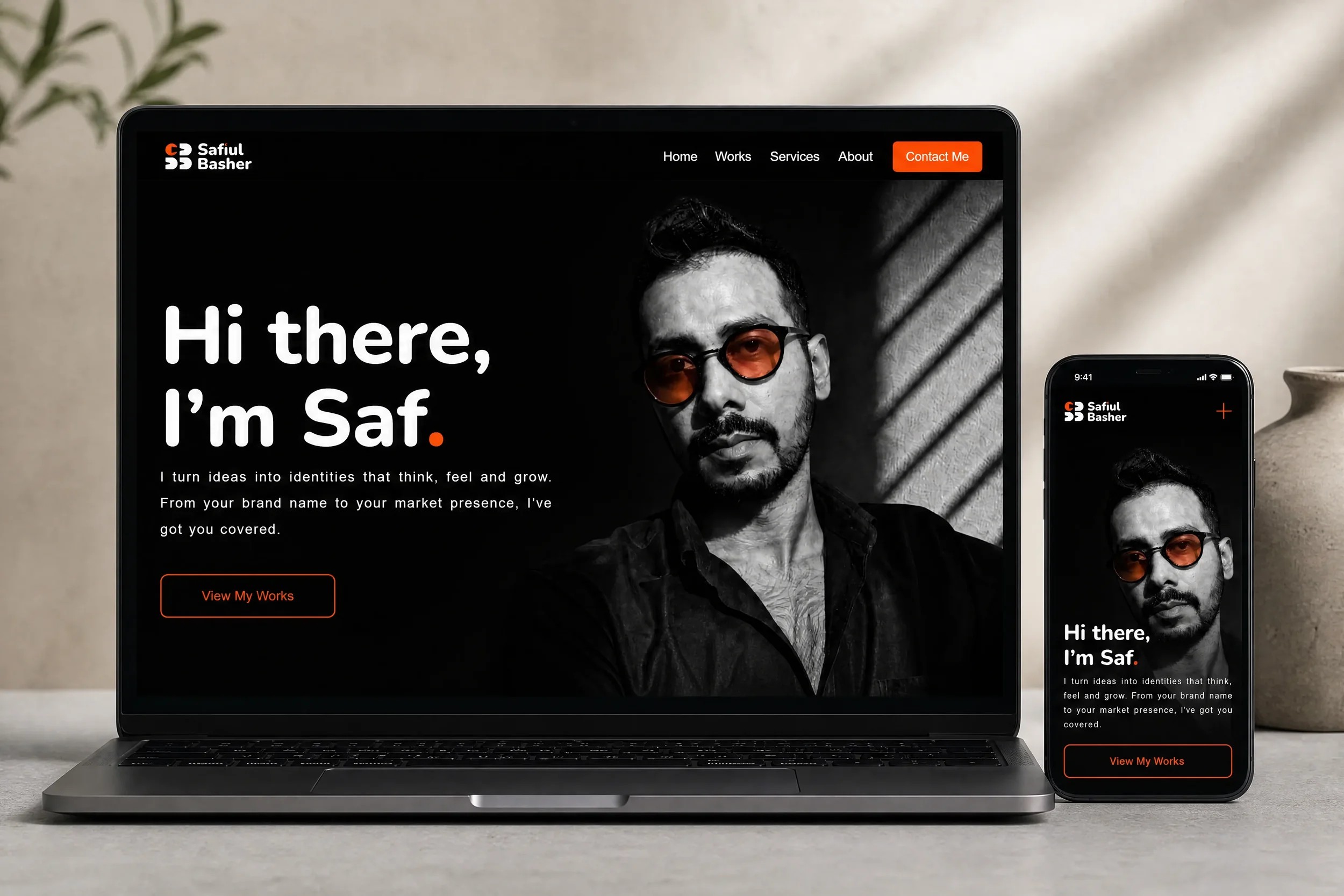
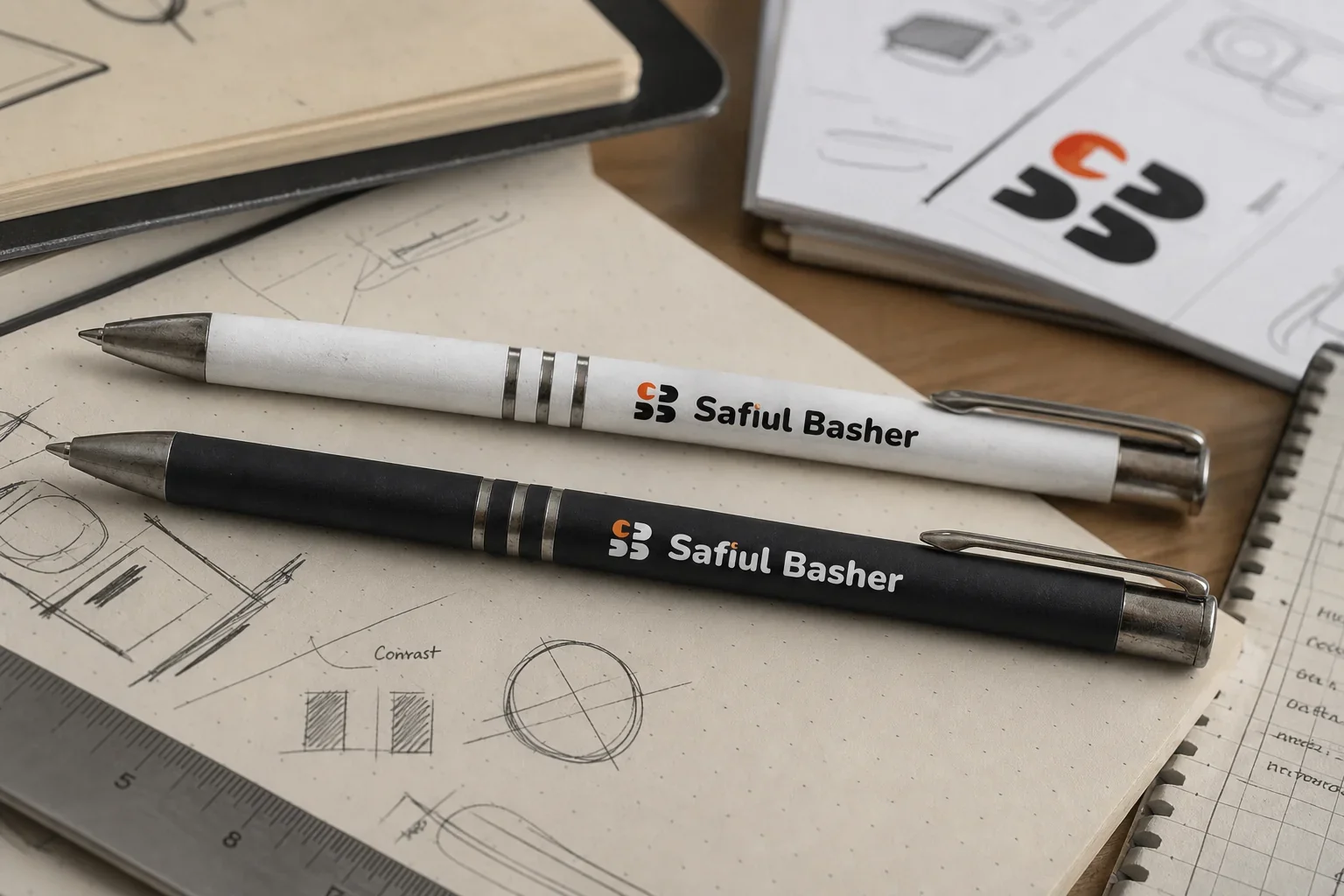
The brief cut through that. Build an identity worth putting in front of any client, any recruiter, any peer. No shortcuts. No decorative thinking. The scope covered the complete system - mark, colour, typography, tone of voice, website, pitch deck, and merchandise. Every touchpoint, not just the logo.
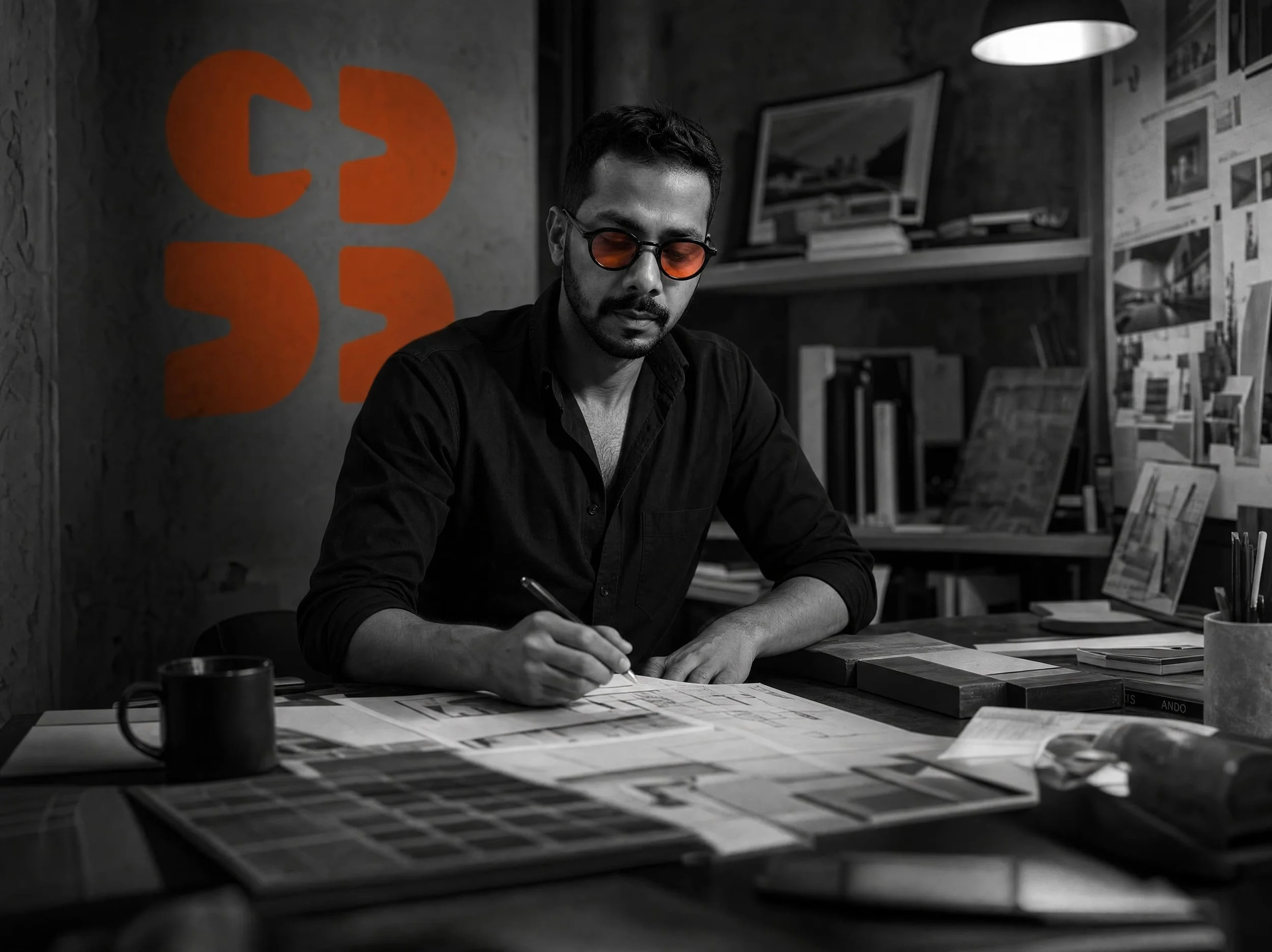
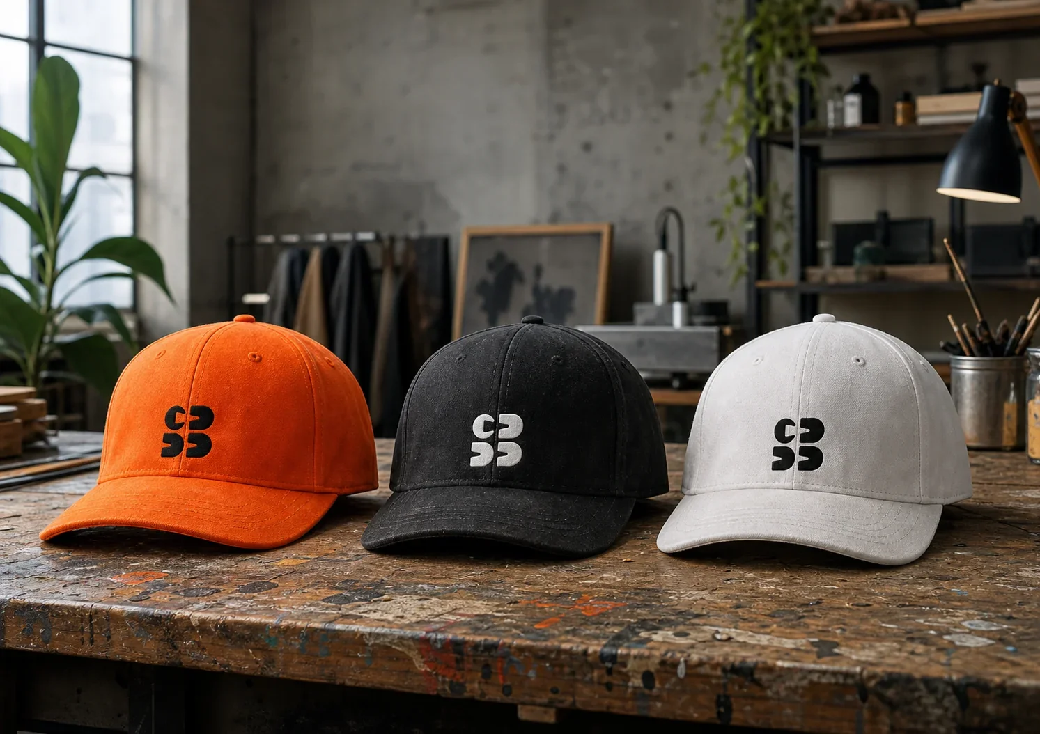
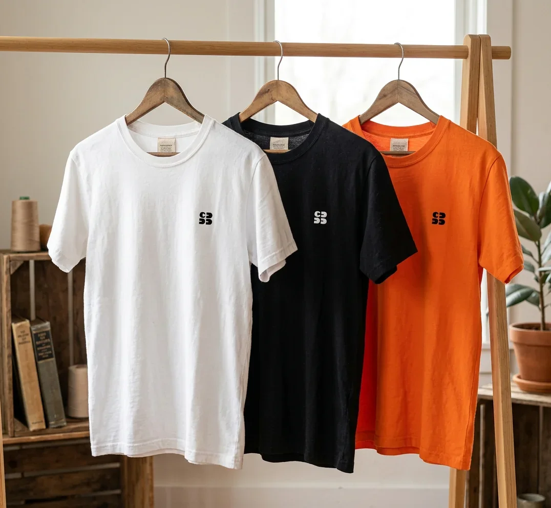
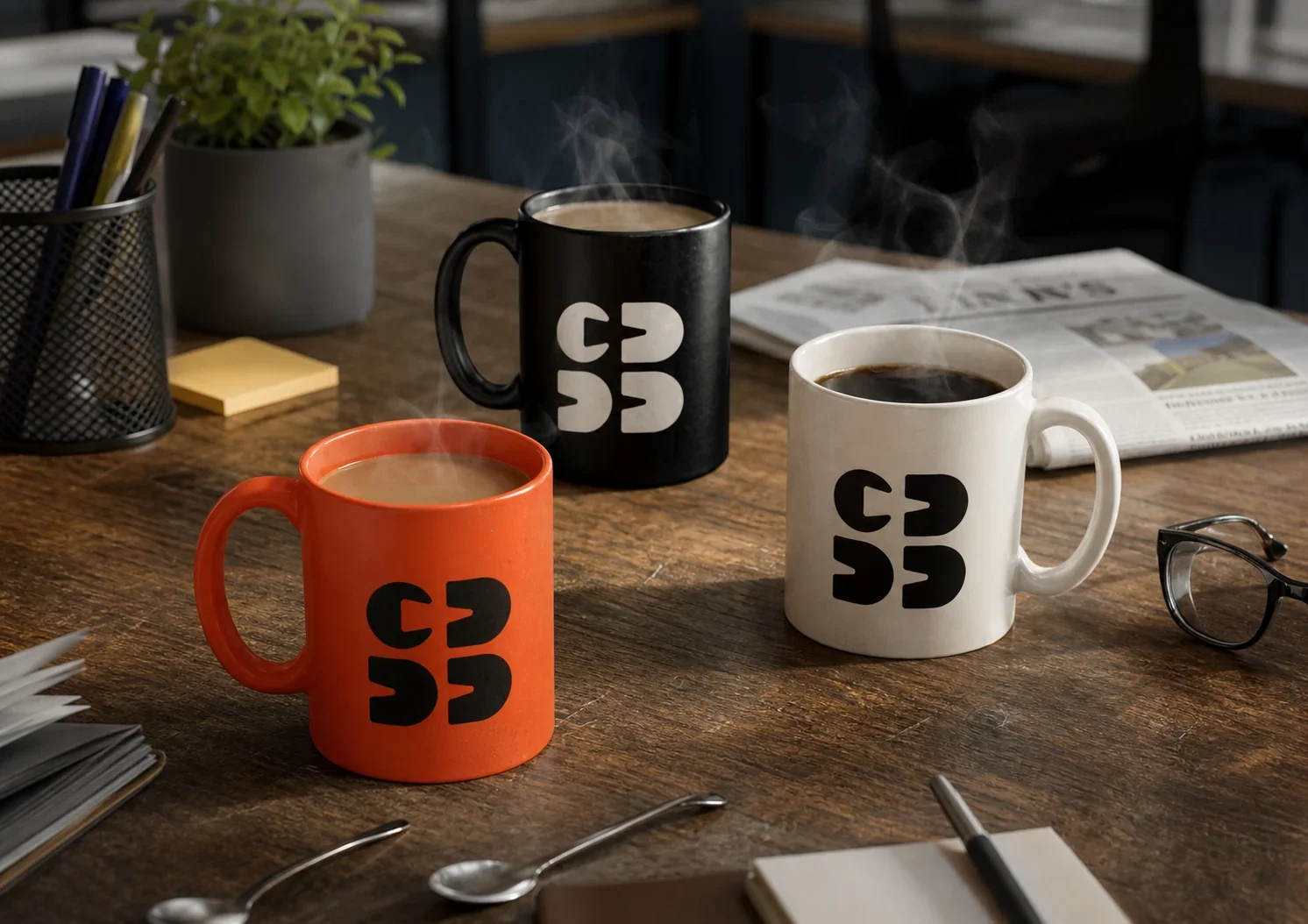
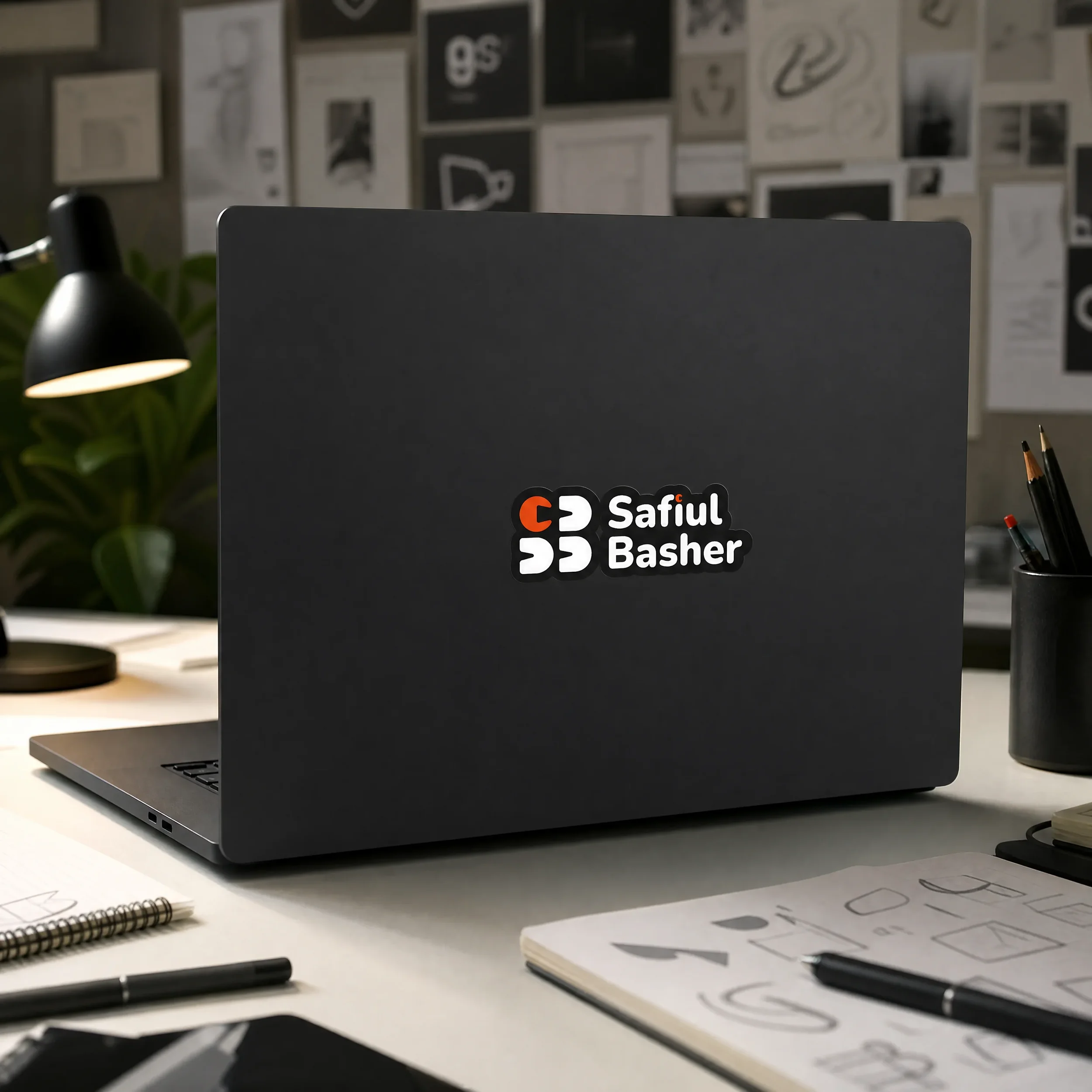
The SB monogram is built on a single structural idea: separation as connection. The letters S and B are each split horizontally into two halves, then rearranged. The tops placed together, the bottoms placed together.
The negative space does the work. The upper half forms a single arrow - representing the strategic connection between strategy and branding. Two disciplines, one direction. The lower half reads as a fast-forward symbol - the momentum of the process, from first idea to complete identity. Nothing in the mark is decorative. Every element has a reason to exist.
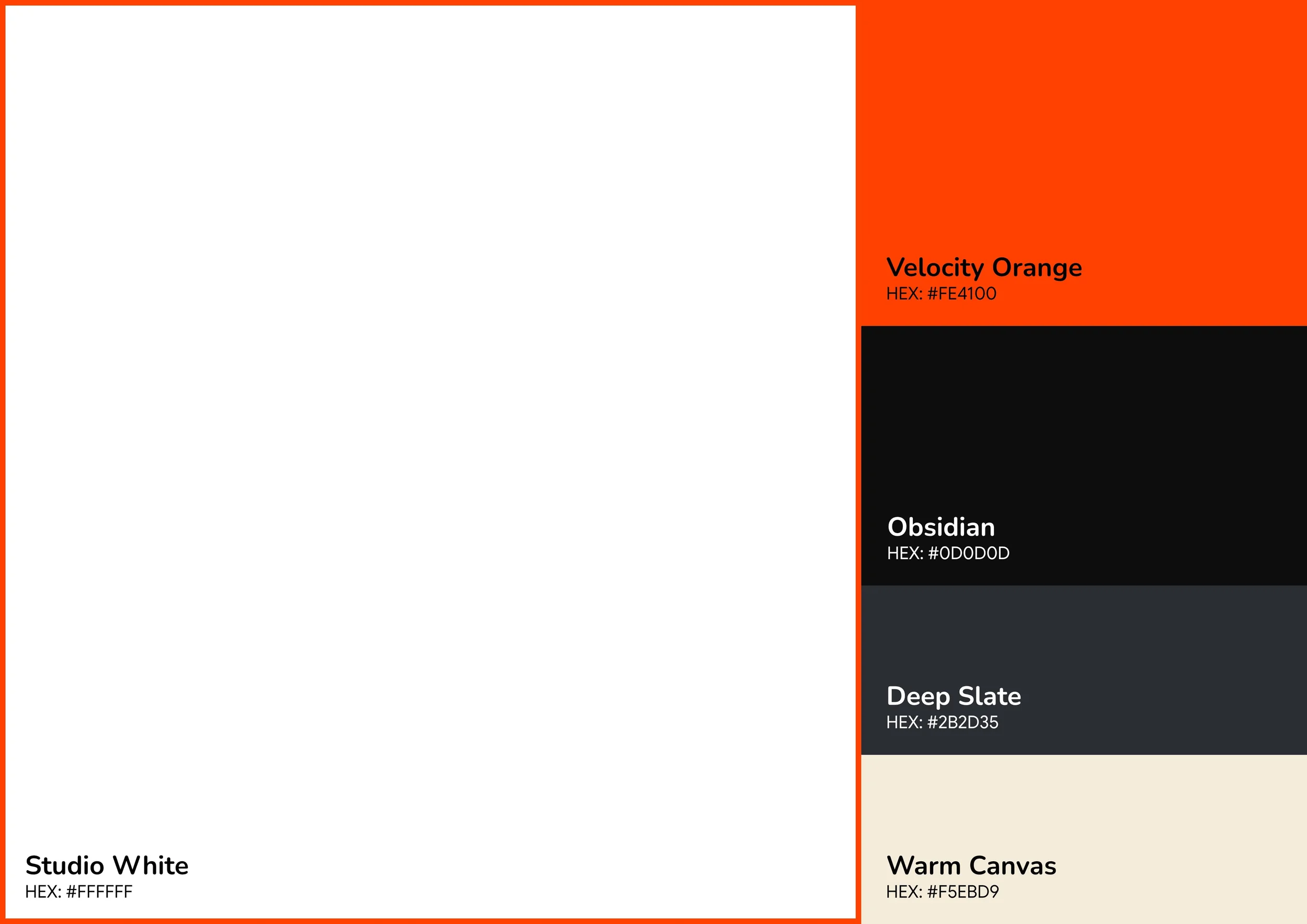
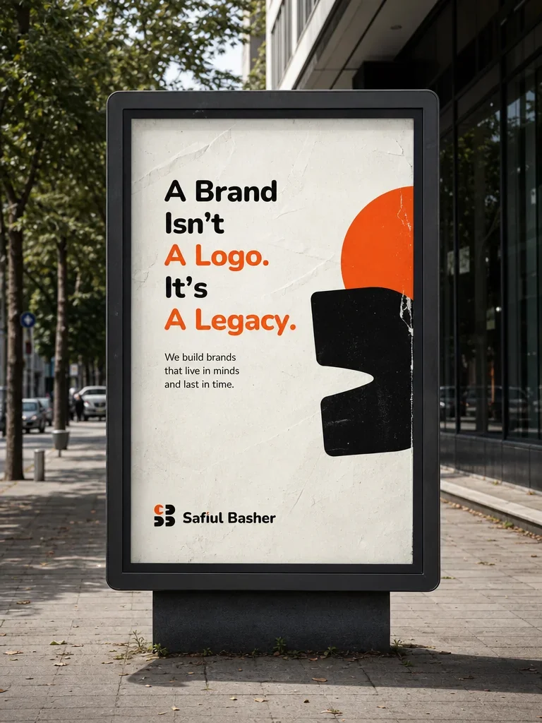
Colour was decided early. A single dominant accent - Velocity Orange -against a near-black ground, with warm off-white for breathing room. High contrast. Immediately recognisable. Impossible to confuse with anything else in the field.
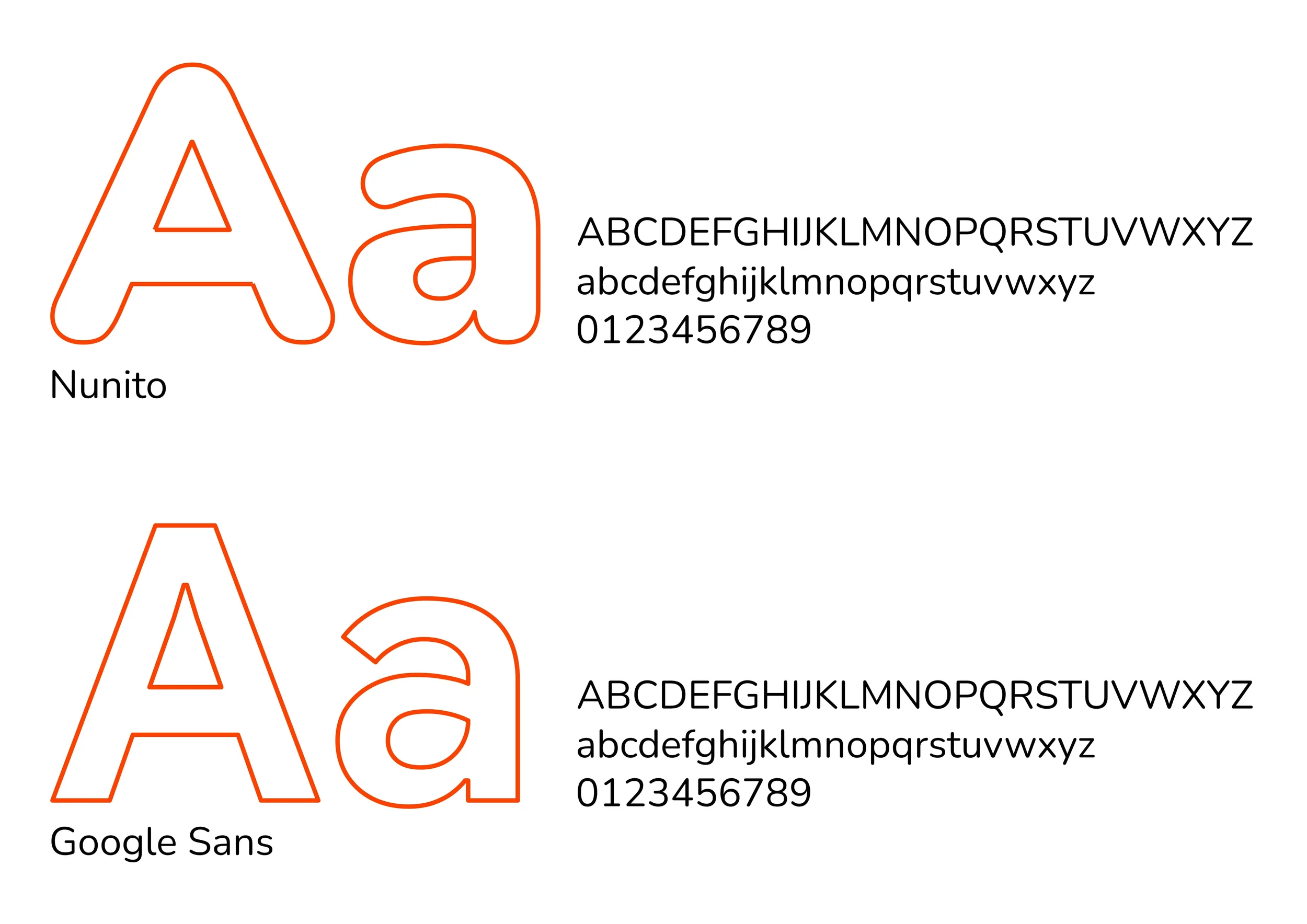
Typography pairs Nunito at bold weights for display with Google Sans for body and UI. Geometric warmth paired with digital clarity. The system was stress-tested across every surface - from a 5mm merchandise label to a 5-metre billboard - because a brand that only works on a screen is not a brand system. It is a template.

Curious to see more of what I do? Explore more of my projects.
Contact .
Let’s Connect .
Got a project in mind? Whether you're starting from scratch or ready to take your brand to the next level - I'd love to hear from you.